 |
As someone with an interest in fonts, typography, and design, this suits me perfectly. I have typeset the document in Palatino 10pt and put in a few little nods towards Victorian book design: drop caps at the start of every chapter, and liberal use of small caps in headings. I was tempted to use a Scotch Roman typeface for the full 19th century effect but decided that readability has to win over period feel!
Anyway, part of the joy of this process is that I get to illustrate my own book! I've used drawing and painting as a creative outlet for most of my life, and in recent years have completed several pieces of mountain artwork, so it makes sense for me to do the illustrations instead of paying someone else to do it.
This is ambitious, particularly since I am not much good at drawing people, but I think it will really add to the period feel. Classic Alpine books such as Whymper's Scrambles Amongst the Alps are lovingly illustrated with pen and ink drawings, and I want to capture some of that atmosphere.
Today I completed two of these illustrations. The first depicts Thomas Holdstock standing on the summit of the Matterhorn after his controversial July 1896 ascent with Simon Barkis. Aleister Crowley has just been swept to his death by an avalanche (or so they think!) and the sport of mountaineering is about to undergo a revolution. It's a striking image which sets the tone for the rest of the book: humanity, puny but daring before nature.
 |
| "THE BIRTH OF A NEW AGE" |
 |
| "JONES FELT VERY SMALL" |
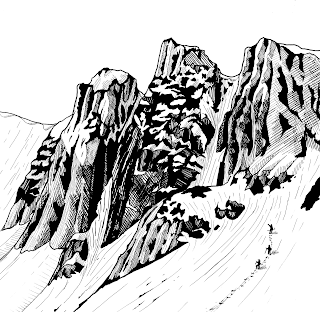
"THE MIST IS RISING!" (first view of the north face of Ben Nevis)
"FROM THIS DISTANCE, IT LOOKED IMPREGNABLE" (Raeburn points out Church Door Buttress)
"JONES TOOK OFF HIS HAT AND BOWED HIS HEAD" (the discovery of the Ice Trap)
"ALEISTER, WAKE UP!" (Elspeth and Crowley sheltering in the avalanche chute in the final chapter)
The actual process of creating these pictures is not as straightforward as you might think. Since the novel's proof is a digital file, the pictures have to be digital entities--but I'm not good enough at drawing on a screen to do all the work by computer. 90% of the work is done with a variety of pens on Bristol board. I use traditional dip pens and Indian ink for bold strokes, and fine technical pens for the detail work.
The image is then scanned into my computer at 300dpi and saved as a TIFF file. I then use an image editing suite to 'clean up' the picture, deepening blacks, flattening whites, removing stray pixels, and making sure everything looks as uniform as possible. I also use this opportunity to neaten up my cross-hatching which is often quite haphazard on paper!
When shrunk down to the necessary size to fit on an 8"x5" page, it looks pretty good. I'm deliberately making these pictures less detailed than some of my other artwork, because simple images work better when printed in books and fine detail work can be lost when printed.
I won't have finished all these pictures for several weeks. When I have, I will be sending the final proof off for review prior to printing the test copy. Exciting times!
All images (C) Alex Roddie 2012. All Rights Reserved.

No comments:
Post a Comment