Showing posts with label art. Show all posts

Saturday, 24 January 2015

Illustrations from after the Alpine golden age


Today I'd like to share some beautiful illustrations with you. One of my most prized books is the Badminton Book of Mountaineering, a massive tome of 19th century climbing lore compiled by C.T. Dent and published in 1892. It features contributions from the greatest climbers of the post-golden age era, including W.M. Conway, D.W. Freshfield, C.E. Mathews, and C. Pilkington.

This book isn't unique. It's one of a number of guides that aim to be complete mountaineering manuals — the most famous is probably Mountain Craft by G.W. Young — but what sets Badminton apart is the charm and humour of the illustrations. The captions are frequently witty (or not so witty) puns. There's a real sense that mountaineering is starting to find itself again as the 19th century draws to a close. After the 1865 Matterhorn disaster, and the first ascents of all the 4000m peaks were completed, Alpinism experienced something of a lull — but it didn't take too many years for a new generation to burst upon the scene with enthusiasm and new ideas.

Badminton is also notable for being the book that Aleister Crowley used to teach himself climbing.

This book has been absolutely key in shaping my knowledge of Alpinism in the 19th century, and was one of the most important sources of inspiration for The Only Genuine Jones and Crowley's Rival. I'll let the pictures speak for themselves. (Click for a larger version.)


This is the only photograph in the entire book.


Sunday, 1 December 2013

The Atholl Expedition - introducing illustrations by Catherine Speakman


I drew my own illustrations for The Only Genuine Jones, but The Atholl Expedition is an entirely different project and I had a very specific look in mind for the artwork. Classic Alpine mountaineering books like Scrambles Amongst the Alps and The Playground of Europe are brought to life by charming and distinctive black and white illustrations depicting scenes on the mountain. Since The Atholl Expedition is the first volume in my Alpine Dawn series, I wanted to evoke that style and take the reader back to the mid 19th century.

I have commissioned Catherine Speakman (also a talented mountain photographer) to create four pieces of artwork for my book, one of which is shown above - a quick snap, I must hasten to add, not the final high quality scanned article. I'm astonished by the quality of her work and also how perfectly she has managed to capture my characters and ideas. In the picture above we see Queen Victoria and Prince Albert watching the champion hart of Atholl, Damh-mor, at rest before the ice-filled amphitheatre of Braeriach and Sgòr an Lochain Uaine.

Catherine has brought my story to life just as vividly as Edward Whymper did for his own classic mountaineering books, and I can't wait for my readers to see the rest of her illustrations.

In other news, I have sent my manuscript off to my editor for professional scrutiny and all is on track for a Christmas release of the Kindle edition. If you enjoy my work, please, please do all you can to build excitement and anticipation; I rely on the enthusiasm of my loyal fans, and so many of you have already shown much kindness in spreading the word and helping to build momentum.

For those of you who prefer the physical article, don't worry: a paperback edition is also being produced, although it won't be ready until early 2014. I'm really excited about this book and I hope it will serve as a worthy prelude for my new series of mountain fiction.

How to get the book before (almost) anyone else

I maintain a mailing list exclusively for new releases and special offers, and subscribers to this list get early access to my new releases - and at a lower price than the standard published rate. For the opportunity to get The Atholl Expedition before it goes on general sale, please subscribe to my mailing list.

Image (C) Catherine Speakman 2013. All Rights Reserved.

Monday, 18 March 2013

An interview with Jamie Hageman, mountain and landscape artist


Jamie Hageman mountain artist

This is part of a series of interviews with authors, photographers, film-makers, and other creative people who all have one thing in common: a connection with mountaineering culture.

Today I would like to welcome mountain artist Jamie Hageman to my blog. His extraordinary paintings are regularly exhibited, and thanks to his distinctive (and very realistic) style his work has attained widespread recognition and praise.

Please introduce yourself. Who are you and what do you do?
I'm a full-time mountain landscape painter living in the Scottish Highlands. I grew up in the flat lands of Lincolnshire, but through walking trips to North Wales from the age of ten, I slowly became obsessed with mountains - climbing them, reading about them, studying maps and of course drawing them. I moved up to Scotland in 2002 and can't imagine living anywhere else now.

You are both a climber and an artist--a not uncommon combination (when 'artist' is considered as a broad term). Why do you think art and mountains have such a strong association?
Painting the mountain landscape is a way of portraying the strong emotions I feel when I experience those great moments in the hills. People who have never seen such things might just be able to experience them viewing a painting, while others who have can identify with those moments through their own mountain travels. Climbing for me has always been about excitement and adventure. The phenomenon of encountering something terrifying but also beautiful has inspired artists for aeons. I'm continuing that focus, always aware of the possibility of the Sublime in the mountains, and putting myself in positions where I might experience it.
Jamie's stunning vision of the Northeast Face of Ben Nevis 
Do your paintings begin as an idea, or as a moment on the hill?
A real mix actually. In the case of my recent Ben Nevis Northeast Face painting (above), I'd seen the possibility of a great view on the map. Looking at the Northeast Buttress end on, it appears as a singular sharp peak rising straight up from Coire Leis. If you head up the opposite side of the valley a little way (on the bouldery flanks of Carn Mor Dearg) the buttress appears sharper and more spectacular, and the rest of the Ben Nevis cliffs come into view. The first time I saw it, I couldn't believe it! A very special view, and one which I've painted many times over the years, in all sorts of weather and conditions.

Other times I'm just out and about, and I'll notice something special. It might be a fleeting glimpse of a towering pinnacle through the mist, or an unexpected view of a familiar mountain. I suppose the key is to always be looking at your surroundings, and visualise how finished paintings might look.

Your paintings have a very distinctive style. How do you achieve such realism?
I've always painted in this style. It's what comes naturally. I love the detail and chaotic nature of the mountains, and I find that painting is a bit like building my own mountains from scratch - like model making. I can make them as realistic or fantastical as I like. Some features I'll make sure are accurate, almost like a topographical diagram showing climbing routes. Other features can be in a more impressionistic style, so long as they're still believable As for how I achieve that realism, It's down to lots and lots of patience. I'm never in a hurry to finish a painting, though some days the slow advancement is barely noticeable!

Describe your most memorable or enjoyable mountain day.
Probably my most memorable day was ten years ago alone in the Pyrenees in winter. It was my first foreign mountain trip, and I suppose I was a bit naive. I tried to climb the Grand Fache in dodgy snow conditions. Just getting to the foot of the mountain was a mission and took me a couple of days. I struggled to find a route up the northwest face which avoided the relentless wind, exposure and unconsolidated snow. I turned around when I felt out of my depth, but that experience has lived with me very clearly ever since.

A really enjoyable trip was in 2009, when I spent four of the coldest days of the winter on Skye with the tent. It was a proper adventure, and the mountains were pristine. I will never forget seeing Sgurr nan Gillean from the south for the first time. It's a fairytale cloud piercer from Sgurr Beag! My subsequent painting is one of my favourites.
The Central Cuillin by Jamie Hageman 
Which of your paintings challenged you the most?
I think the Ben Nevis Plateau painting challenged me the most. It's still the largest painting I've done (about one and a half metres wide I think). Just maneuvering to be able to paint it was difficult. I love painting on that scale, but I have to think about how practical it really is.

Can you tell us anything about your future projects?

I have so many ideas - I make lists of potential views, paintings, drawings, sketches and print ideas. They change frequently, but a couple that keep cropping up are the Lake District (I'd like to paint Blencathra, and maybe Scafell), and the Alps. I might try to get down to the Lakes before this snow disappears (has to be snowy), and I'm planning a trip to see Mont Blanc and the Matterhorn from hopefully some impressive but slightly less obvious angles. The Himalaya is still calling me, and I either need to tag along with an organised expedition, or arrange my own with a mate. Exciting to be thinking about these things - planning is half the fun! As for Scotland, the list seems to be never-ending.

Tell us about how we can find out more about your work.
My website is www.jamiehageman.com and I'm on Facebook - https://www.facebook.com/#!/JamieHagemanMountainArtist

I'm taking part in the spring show at Resipole Studios across the Corran Ferry in Ardgour, so there'll be some new work appearing there. Right, back to my paints.

Thanks to Jamie for the interview!

All images (C) Jamie Hageman. All Rights Reserved.

Friday, 30 November 2012

The writer's relationship with landscape

Aonach Dubh west face diagram
A page from my "crag book"
Like many writers, my work is inspired by one thing above all else: landscape and its human context.

My work is historical fiction first of all, but it's also adventure writing about mountains and mountaineers. These adventurous activities would not exist without the geography of hills, crags, gorges, icefields, cornices, chimneys, aretes, and scree-slopes; and yet, the landscape itself would have no meaning to me as a writer without the human context. Over the centuries, humans have explored their mountainous surroundings, given names to peaks and glens, risked their lives (and often lost them) to make first ascents, left their mark on the landscape.

These whispers of human activity are everywhere in the mountains even though we think they are wild places. The summit is topped with a cairn built by human hands. The hillside is cut by an eroded path. Even the remote cliff face, unexplored for a hundred years and dripping with slime, will often bear some trace of the pioneers who passed that way decades before: a rusted piton protruding from a crack, or the scratch of a crampon point on rock.

Open a guidebook and the trails blazed by human explorers cover the mountains like a thousand luminous threads. Human legacy is everywhere in the mountains.

I used to believe that the wildness of the mountains inspired me the most, but on a trip to Jotunheimen (Norway) in 2010 I actually realised that when mountains were stripped of human context, they became almost meaningless to me. I trekked for days throughout a wilderness more barren and wild than anywhere in Scotland: a place where many mountain faces were unexplored, and many features did not have names. I enjoyed my expedition, but it did not inspire or thrill me like Scotland or the Alps.

As a writer, I draw inspiration from the complex forces that bind humanity to mountain landscape. My time spent in Glencoe was particularly special from the perspective of a writer, because I had an opportunity to develop my own special connection with the landscape around me. I explored the places where people had been before, using the guidebooks; then I put the guidebooks away and sought out the few places that people had never been. I wrote up my explorations in a "crag book" which I illustrated with diagrams showing my routes of ascent.

Without this human connection to a landscape, an artistic mind has a hard time fully appreciating mountains, except as mere scenery. They are so much more than that, but it takes a human connection to achieve it.

Climbing bears many similarities to a good story: triumph, tragedy, danger, and struggle; moments of beauty and moments of defeat. It's no accident that the mountains have inspired innumerable books, poems, paintings, and pieces of music.

Humanity: puny but brave before the awesome splendour of Nature. That's what inspires me the most and what fuels my stories.

Bidean nam Bian

Wednesday, 14 November 2012

A few more illustrations


Today I've been busy doing some more original drawings for the paperback edition of The Only Genuine Jones. It's a time-consuming job but luckily it's something I love doing. Although my drawing skills can't match those of Whymper, I have tried to emulate his style. Whymper's illustrations have a timeless charm--a glimpse into a vanished Alpine world. I want my book to evoke that world, so once again I have turned to Whymper for inspiration.

I completed three drawings today. The first is designed to be a small graphic for inserting at the end of chapters, and the other two are intended for specific points in the book. The picture of the Eiger will accompany the heading for the second part of the story (The Great White Veil), and the picture of Ben Nevis will fit into Chapter Six (Orion).


"SLEEP EVADED RACHEL THAT NIGHT"


"THE MIST IS RISING!" 


Monday, 12 November 2012

Illustrating the paperback edition


I am currently in the process of converting The Only Genuine Jones into a real paperback book through FeedARead. The company, which is a print-on-demand publisher, allows authors a huge amount of freedom when it comes to designing their books; in fact, you have the option of doing absolutely everything yourself except for the actual printing.

As someone with an interest in fonts, typography, and design, this suits me perfectly. I have typeset the document in Palatino 10pt and put in a few little nods towards Victorian book design: drop caps at the start of every chapter, and liberal use of small caps in headings. I was tempted to use a Scotch Roman typeface for the full 19th century effect but decided that readability has to win over period feel!

Anyway, part of the joy of this process is that I get to illustrate my own book! I've used drawing and painting as a creative outlet for most of my life, and in recent years have completed several pieces of mountain artwork, so it makes sense for me to do the illustrations instead of paying someone else to do it.

This is ambitious, particularly since I am not much good at drawing people, but I think it will really add to the period feel. Classic Alpine books such as Whymper's Scrambles Amongst the Alps are lovingly illustrated with pen and ink drawings, and I want to capture some of that atmosphere.

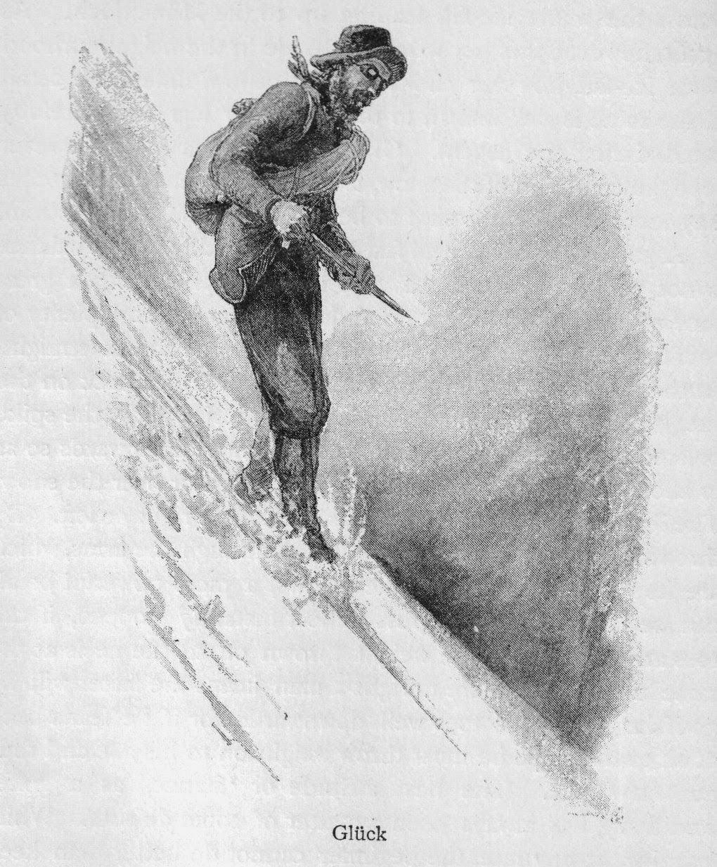
Today I completed two of these illustrations. The first depicts Thomas Holdstock standing on the summit of the Matterhorn after his controversial July 1896 ascent with Simon Barkis. Aleister Crowley has just been swept to his death by an avalanche (or so they think!) and the sport of mountaineering is about to undergo a revolution. It's a striking image which sets the tone for the rest of the book: humanity, puny but daring before nature.

"THE BIRTH OF A NEW AGE"
The second will feature as a small image beneath the heading for Part One, and shows a key event in the first chapter: climbing up into Coire nan Lochan at dawn.

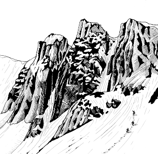
"JONES FELT VERY SMALL"
I have planned four other illustrations which will all describe key scenes in the book:
"THE MIST IS RISING!" (first view of the north face of Ben Nevis)
"FROM THIS DISTANCE, IT LOOKED IMPREGNABLE" (Raeburn points out Church Door Buttress)
"JONES TOOK OFF HIS HAT AND BOWED HIS HEAD" (the discovery of the Ice Trap)
"ALEISTER, WAKE UP!" (Elspeth and Crowley sheltering in the avalanche chute in the final chapter)

The actual process of creating these pictures is not as straightforward as you might think. Since the novel's proof is a digital file, the pictures have to be digital entities--but I'm not good enough at drawing on a screen to do all the work by computer. 90% of the work is done with a variety of pens on Bristol board. I use traditional dip pens and Indian ink for bold strokes, and fine technical pens for the detail work.

The image is then scanned into my computer at 300dpi and saved as a TIFF file. I then use an image editing suite to 'clean up' the picture, deepening blacks, flattening whites, removing stray pixels, and making sure everything looks as uniform as possible. I also use this opportunity to neaten up my cross-hatching which is often quite haphazard on paper!

When shrunk down to the necessary size to fit on an 8"x5" page, it looks pretty good. I'm deliberately making these pictures less detailed than some of my other artwork, because simple images work better when printed in books and fine detail work can be lost when printed.

I won't have finished all these pictures for several weeks. When I have, I will be sending the final proof off for review prior to printing the test copy. Exciting times!

All images (C) Alex Roddie 2012. All Rights Reserved.

Monday, 15 October 2012

The writer's notebook(s)

Notebooks are about feel, mood, and introspection--not utility.
Before I begin this post celebrating notebooks, I have a confession to make: I hardly ever use them. I write historical fiction set in the 19th century and love the aesthetics of that era, but am also a self-confessed computer geek. This is something of a contradiction--one I have learned to live with.

I have previously blogged about technology for writers, and to read my previous posts on the subject you might be forgiven for thinking all of my writing is done digitally. The fact is that in the second decade of the 21st century nobody has any excuse to still be using paper for the majority of their writing; it's inefficient, environmentally unfriendly, generates waste, and requires physical storage space. Filing and indexing is time-consuming (and if you try not to bother, you will never be able to find anything you write down). Writing by hand is slow and editing is difficult. For these reasons, the bulk of my writing is done by computer in various forms; this includes note taking, research, and drafting.

And yet ...

There's something about physical notebooks that cannot help but touch the soul of a writer. A computer is efficient and can do a dozen things at once, but let me turn that around: a notebook has value precisely because it is inefficient and can only single-task.

When you write in a notebook, you are focusing on a single thing at one time. There are no distractions fighting for your attention. You are consumed with the task of composing words into sentences using the age-old instrument of a pen or a pencil: a process which is slow and primitive compared to typing, but sometimes what we need is to slow down and focus for things to snap into place. Twitter, Facebook, and all the other powerful tools of a modern writer's existence are temporarily obliterated. It is the ultimate minimalism in writing.

This brings me to the second benefit of notebooks: tactility. A writer's notebook is far more personal than a .TXT file containing your thoughts, stored somewhere in a computer's memory. Handwriting itself conveys personality and mood, and in a notebook one is free to doodle, draw, and map out ideas. They become a tangible connection between our moods and thoughts at some point in the past, and the point at which we are reading this information. A data file cannot do this.

Notes taken in 2010 during my trip to Grindelwald. Left is a sketch for the 1897 Eckenstein ice claw; right are some of my initial ideas for a future novel.
How do I use notebooks? I use pocket Moleskine journals whenever I travel for research purposes. These books are tiny and very resilient; I currently have a collection of 12 which document every research trip I've made over the last five years. They chronicle my investigations in the streets of Zermatt and Evolene, the peaks of the Alps, and the valleys of the Lake District. When I read their pages--which are often smudged by rain or dog-eared by travel in a rucksack--the tactile nature of this recording medium takes me back to the place in question more surely than any digital file could.


Notes from a trip to Wasdale Head. +1 for anyone who gets the significance of this page in the context of The Only Genuine Jones.
I also keep a large 'project sketchbook' for important drawings and plans. In this book I draw maps, family trees, designs for equipment in the fictional Jones universe, and anything else that requires a larger canvas.

Do you still use notebooks? How do you use them, and how do they integrate with your digital methods of writing? I'd be interested to hear any views!

Wednesday, 18 July 2012

I have a cover design!

Ta-da!
Thanks to the swift and very talented work of John Amy, I have a cover design I'm happy with!

Creating a cover for The Only Genuine Jones wasn't an easy order. The design has to convey genre and tone instantly, even at thumbnail size. It has to get across the message that the book is set in the past, but I didn't want it to look dusty or faded: this is a story about real people facing modern problems, not a rose-tinted look back at a byegone age.

Vintage yet modern ... historical fiction ... a big dose of mountains ... all round, a difficult blend. I think John's design strikes the balance very well, although it took us a while to get there with plenty of discussion generated by his original ideas. It had to be just right.

The mountain in the background is the Eiger, which features prominently in the story, and the ice axe is the 'Prima' design, very similar to the one Jones used in his final years of life. I'm very grateful to the owner of the image for allowing me to use it.


Needless to say, the design is very strictly all rights reserved.
Cover design and montage by John Amy, www.ebookdesigner.co.uk
Ice axe original photo courtesy of Monte Dodge

Tuesday, 3 July 2012

The first step

My mission to publish my novel as an eBook has started with a simple step--read as much as I can on the subject! To that end I have started to read "Let's Get Digital" by David Gaughran. So far I'm part of the way through the section where he outlines why digital dominance is inevitable, and why print media is doomed (and far more imminently than I originally thought). It's sobering material, but has served to make me more convinced than ever that my decision is the correct one.

Print is doomed. Much as I love physical books, especially quirky second-hand bookshops, none of us can afford to be too sentimental about this--we have to be ready for the future.

So while I read the book, I've been experimenting with cover designs. Most of the more successful eBooks have had their covers done by a professional, but a large number of authors are now choosing to do the design work themselves. The results can be dreadful, but they can also be very good, and I want to explore this option before committing myself to paying a graphic designer.

I have a number of requirements for my cover:
  1. Most importantly, it must convey the necessary information in a clear and concise manner at a number of different scales, from thumbnail to large format eInk screen.
  2. It must have high contrast.
  3. It must be striking. It must draw the reader to the book and make them want to read it.
  4. It must accurately convey genre and tone (a surprisingly subtle matter, when you really think about it).
  5. It must feature an iconic image, quintessential to the soul of the book.
Here is my first attempt:

The image appeals to me for a number of reasons. It has contrast and simplicity; it has a striking image absolutely quintessential to the story (Jones' team approaching the Ice Trap); it renders reasonably well on an eInk screen.

However, the climbing figures are minute, and cannot be clearly discerned on the screen of a Kindle (forget about a thumbnail image). Without the figures to give scale and context to the image, the rest of it is just a wiggly line.

Secondly, the font, while appropriate in some respects, is not bold enough to be clear when viewed at small sizes. Scotch Roman is a Didone typeface with big contrast between broad and narrow strokes. Much as I love Didones, it's not appropriate here.


And here's another go:

A definite improvement, with greater clarity of text (while maintaining the necessary period feel). The image is just as iconic--although I couldn't find a way of including the icicles in this one without sacrificing simplicity. I've been able to give the climber far more character than the tiny figures in the previous cover. The hat and pipe instantly convey to the reader that this is a period novel, while the crampons and ice axe tell the informed reader a little more.

Even someone with no knowledge of climbing whatsoever can clearly see that this is an ice climber, alone at the foot of a wall of ice, preparing himself for the challenge above. I think this is a suitable microcosm of my entire story, and sums up Jones' questing character perfectly.

Will I use this as my final cover design? Probably not--and I'm still strongly considering getting something more professional made by someone who actually knows what they're doing. But I think it's an important stage in the process, as now I have something real I can visualise when I think of my novel as an eBook.


All images (C) Alex Roddie 2012, All Rights Reserved.


Monday, 14 May 2012

Something a little different


Over the years, I have found that my appreciation for mountains is best expressed in three different ways: literature, music, and art. Literature is obvious enough (it's the reason this blog exists, after all); for music, I find references in dozens of classical symphonies to the wonders of nature, and mountains in particular. Art is perhaps the most obvious. I have long been a fan of the work of Jamie Hageman, Lochaber-based mountain artist and fellow ex-Clachaiger. Partly inspired by his stunning paintings, partly motivated by my own experiences, I have gradually been producing a number of my own drawings based on the mountains of Scotland.

Some of them were created in 2010 using digital techniques, but my most recent effort is a traditional pen and ink drawing of Bidean nam Bian.

I hope to continue producing these pictures from time to time, as a rewarding distraction from writing!

"The East Ridge of Bidean nam Bian," 2012
"The Ben Nevis summit observatory," 2010

"Cloud inversion in Glen Kinglass," 2010


"Ben Nevis in 1837," 2010